


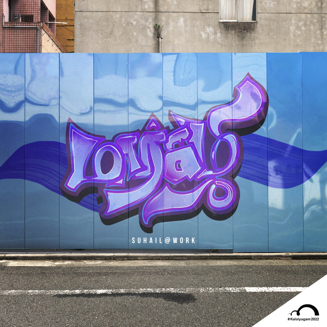


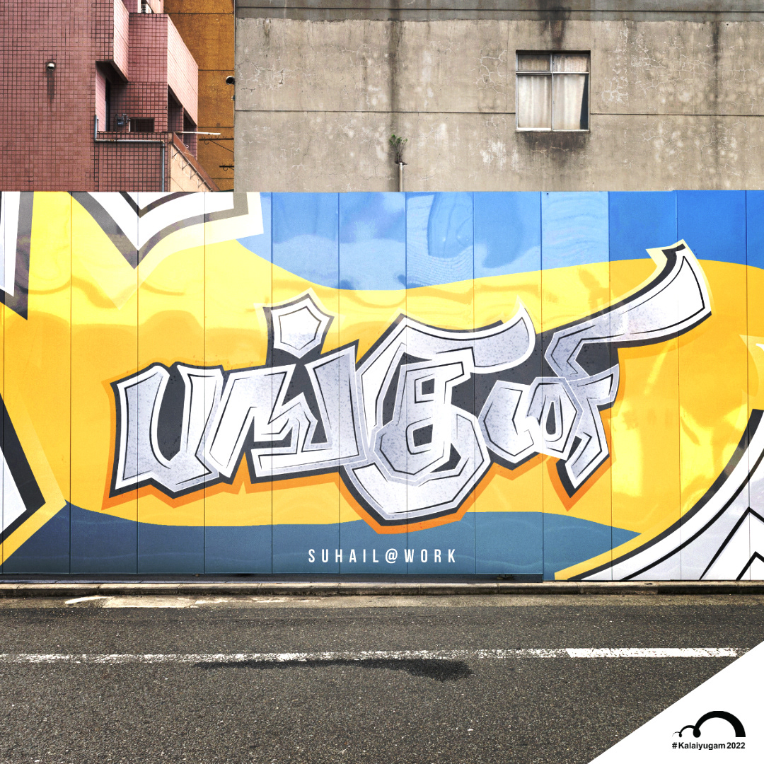
As a designer, illustrator, and typographer, I am constantly inspired by any art form and the sheer exhilaration it provides. Graffiti is one such art that has always fascinated me, and I have always found myself drawn towards it to explore more. The common understanding of Graffiti is — it is a form of street art that involves creating letters or words using graffiti techniques. And so, here I am on this journey with childlike enthusiasm to create something that involves the core Graffiti style of using text.
Tamizh has a complicated set of scripts comprising 247 alphabetic characters, including 12 vowels, 18 consonants, 216 combinatory letters, and one unique character. But, through a designer’s eye, all scripts are lines and curves! And tamizh alphabets present a unique challenge —as the lines and curves in it have to maintain the actual structure at all times, and extra curves or lines can change the meaning!
So, that’s the turf that I am playing on. I am not alone in this. There are lots of other designers that are exploring different styles in tamizh typography as we speak. But we all have one thing in common. And that’s the love we have for the language, which provides the much-needed impetus and drive.
Madrasters organise a yearly challenge called Kalaiyugam; the first two years were about creating alphabets, and this year, the topic is tamizh months. My focus while creating this digital form of the name Thamizh months has been only the appearance of the names (rather than the meaning of the names itself). And to achieve this, I have used Adobe Illustrator and Photoshop.
So how do I go about it? You can get a spark from many things. In its many forms, nature has provided many ideas through the years and still surprises me. Swaying trees, a group of birds, clouds in various shapes — they never cease to amaze me. And I see them differently. Those are the optics that give me ideas. And then I try to adapt the shapes, strokes, style, whatever you call it, in my rough sketch. Once that gets a good condition, I take it to adobe Illustrator to do live paint and add nice gradient colours for the shapes. By using the offset option, I get good depth for the typography, and then I use photoshop mural mockups for the presentation.
I hope you find this interesting. I will be coming up with more graffiti styles in the future.


